Agile


T&G – the evolution of a brand
27 April 2017
We spoke to Paul Tabouré, executive creative director of brand agency THERE, about how the T&G logo has evolved from its origins as the marque for Temperance & General Mutual Life Assurance Society to its current incarnation as the hallmark of Pembroke’s reimagined T&G Building.
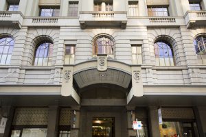
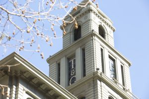
The original Temperance & General logos that adorn the heritage T&G Building in Melbourne are an enduring legacy of a brand – Temperance & General Mutual Life Assurance Society – that once dominated the Australasian insurance industry.
The T&G Building, on the corner of Collins and Russell Streets in Melbourne’s CBD, is one of Temperance and General landmark offices that were built in capital cities across Australia and New Zealand. In their day, these buildings were impressive workplaces, where significant business flourished. Those built from the late 1920s, such as Melbourne’s, all featured a landmark tower with a distinctive stepped top and the company’s name in an early form of corporate advertising. Sadly, few of these buildings have survived, making Melbourne’s T&G Building quite special.
At the request of international real estate firm Pembroke Real Estate, THERE worked closely with the project partners behind the major revitalisation, architects Bates Smart and Pembroke, to decide on the best name for the modern building and it was agreed that conveying the ‘authentic’ story of this heritage landmark was the best approach.
The team looked to celebrate the building’s rich history, and its established place in Melbournians’ affections, and embrace the original T&G logos that adorn each of the entrances and are, quite literally, built in to the building’s fabric.
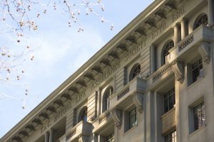
Pembroke Real Estate’s visionary refurbishment of this heritage site is an elegant, modern reimagining of a building that was once voted Melbourne’s most beautiful building. The new look reflects contemporary best practice in the workplace, and for this reason, it was important to design a clean, modern, forward-looking identity, but one that retained more than just a nod to its heritage.
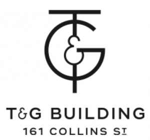
THERE studied the original logo and strived to pay homage, yet modernise it, to better reflect businesses of today. They retained the entwined T and G, yet re-drew each letterform, together with the ampersand, to create a visually understated logo ligature where the ampersand acts as the central pivot to the design.
The intention for the overall look and feel of the T&G Building’s brand was to create an iconic monogram, supported by a rich colour palette and textural graphic language: the T&G colours consists of vibrant orange and rich velvety maroon offset by neutral, warm greys to create a strong palette that reflects the warmth and inviting nature of the building, while the under-awning architectural decorative imprint inspired the pattern used throughout the building’s branding.
Finally, the display font is a contemporary ‘stencil’ font that works because it is a modern take of a traditional type style. It is powerful, confident and self-assured – reflecting all the qualities of the building itself.